Windows Phone 7: Review
Microsoft had to do something pretty special with Windows Phone 7, to match iPhone and Android. It looks to us as if it might have done just that
There are also volume buttons and a camera button – which, Microsoft is proud to point out, has been built to bypass the lock screen so the phone can take photos (in this case using a fairly unexceptional 5 MPixel camera) more or less without a pause.
Early commentators were shocked to discover that Microsoft integrates the SD card with the phone’s main memory, so changing the SD card means rebooting the phone. That’s not something that bothers me – there’s 16GB of space and plenty of ways to get the data off, so I don’t think I’ll ever need to take it out.
The user interface
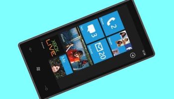
As everyone says, the interface is “fluid” – but the movements happen within simple parameters. The main screen can slide up and down, revealing “tiles” in the order you have chosen to display them. And whether you are in the main screen or inside an application, you can sweep to one side to see more or get to different content.
The home screen is very quiet. Apart from those tiles, there’s a tiny clock at the top gives the time. If you want to know your battery life or signal strength (Wi-Fi and 3G) you pull that down from the top edge of the screen. There’s also an arrow to the right, pointing you to the other view – the list of apps and the all-important Settings icon. That is where you hook up to Wi-Fi, set ringtones and all the rest of it.
Connecting to Wi-Fi is a good idea, by the way, as this is a phone which uses and displays data very well.
So let’s go back to the main screen and start with those big square “tiles”. As everyone knows, these represent functions, and are in fact what anyone else would call a “widget”. They include animation and information, so you can see how many emails you have, or what your next appointment is, before you open the tile.
Great email and calendar
 The main tiles most business people will use – apart from the phone tile – will be email and Calendar, as well as People.
After I entered my Google and Facebook credentials, these tiles started to fill with information. The People tile is now a good responsive Facebook interface, the email tile is labelled Google Mail and gives a good view of what is going on there, and the Calendar Tile tells me what day it is, with a summary of my next appointment.
Inside those tiles, there’s a lot to like. The email app shows everything in the inbox, using a clean type face and a minimum of clutter. Messages can be selected, with a tap on the left of the screen, and filed or deleted in batches. A swipe to the right shows progressively smaller slices of those messages – Unread, Flagged and Urgent.