Expert Questions Usability Of iPad Apps
A usability expert has claimed that iPad apps are inconsistent and suffer from frequent user errors due to accidental gestures
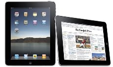
A leading usability guru has criticised the range of apps available for the hot selling Apple iPad, claiming that Apple should not have designed the iPad user interface as a scaled-up iPhone interface.
In a new report, Jakob Nielsen concluded that iPad apps are inconsistent and have “low feature discoverability, with frequent user errors due to accidental gestures.”
iPad User Study
“’It looks like a giant iPhone,’ is the first thing users say when asked to test an iPad. (Their second comment? ‘Wow, it’s heavy.’),” wrote Nielsen.
“We conducted our initial usability studies of iPad apps and content a few weeks after Apple launched the device. We tested 7 users – all with at least three months’ iPhone experience – but only one was an ‘experienced’ iPad user. This user had only a week’s experience – far less than the minimum of one year’s experience that we usually request of usability study participants.”
Nielsen said that, while the findings from this research are only preliminary, he felt that in general iPad apps are let down by “whacky interfaces” and “inconsistent interaction design”.
 “…from an interaction design perspective, an iPad user interface shouldn’t be a scaled-up iPhone UI,” claimed Nielsen. He cited one study finding that the tab bar at the bottom of the screen works much less well on iPad than on iPhone.
“On the small phone, users are likely to notice the muted icons at the bottom of the screen, even if their attention is on content in the middle of the screen,” Neilsen wrote. “But the iPad’s much bigger screen means that users are typically directing their gaze far from the tab bar and they ignore (and forget) those buttons.”
Fat Finger
However, Neilsen did praise the ability of the iPad to better handle websites compared to its smaller cousin, the iPhone.
“Another big difference between iPad and iPhone is that regular websites work reasonably well on the big tablet,” he wrote. “It’s simply too painful to use most websites on the small screen.
“The iPad’s bigger screen offers reasonable usability for regular web pages,” he added. “Of course, there’s still the ‘fat finger’ problem common to all touch screens, which makes it hard for users to reliably hit small targets.”
Regular Web Vs iPad Web
Neilsen warned that the difference between regular websites and those designed for the iPad is quite noticeable. “…most web pages offer a rich and overstuffed experience compared to the iPad’s sparse and regulated environment; when an iPad app suddenly launches users onto the web, the transition can be jarring,” he wrote.
“For more than a decade, when we ask users for their first impression of (desktop) websites, the most frequently-used word has been ‘busy’.
“In contrast, the first impression of many iPad apps is ‘beautiful’. The change to a more soothing user experience is certainly welcome, especially for a device that may turn out to be more of a leisure computer than a business computer. Still, beauty shouldn’t come at the cost of being able to actually use the apps to derive real benefits from their features and content,” he added.
For the study 34 apps and websites were tested, including Alice in Wonderland Lite, BBC News, Bloomberg, eBay (both app and website), GQ magazine, iBook, Marvel Comics, Time Magazine, USA Today, and Yahoo! Entertainment.
The full report is available for download here.